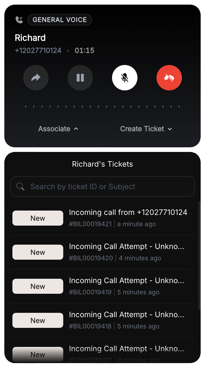
A refreshed look for the Call Widget
We've given the call widget a visual upgrade — new icons, typography, colors and a few smoother animations. This is a skin change only: the call flow and behavior you rely on today are unchanged. Nothing to reconfigure on your end.
Before & after, screen by screen
A few representative screens below to give you the gist — the same visual refresh carries through every widget state, not just the ones shown here.
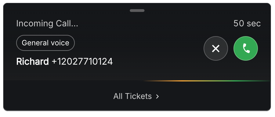
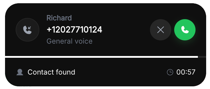
Incoming call
A cleaner header and a flat accept/decline pair replace the outlined buttons and gradient timer bar.
Before
After
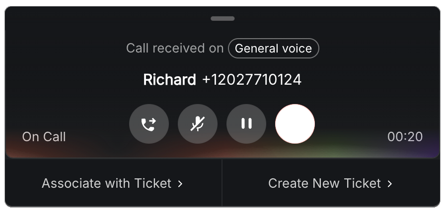
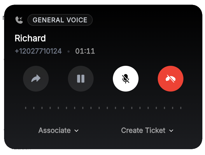
Ongoing call
Contact name and duration now lead the panel, and mute/hold/hang-up sit on redrawn icon buttons.
Before
After
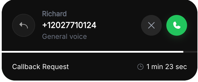
Callback request
The callback icon is redrawn and the request now reads as a labeled row beneath the caller's details.
Before
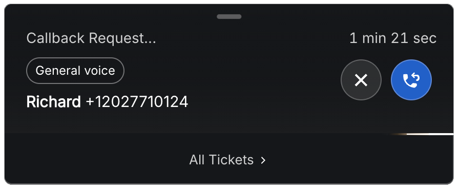
After
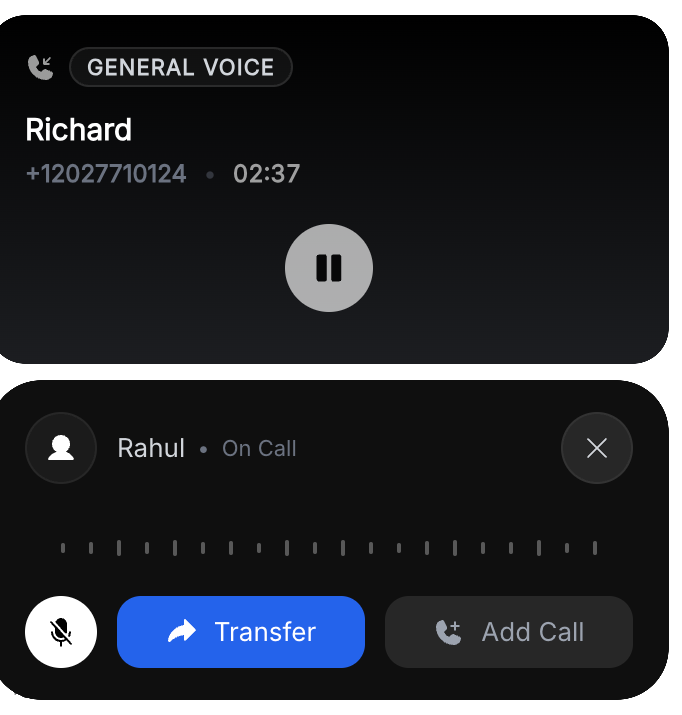
Hold & transfer
Held and active calls now render as two distinct cards with a bolder Transfer button, instead of one stacked panel.
Before
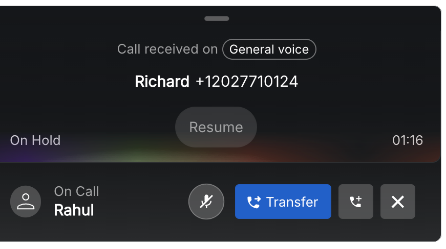
After
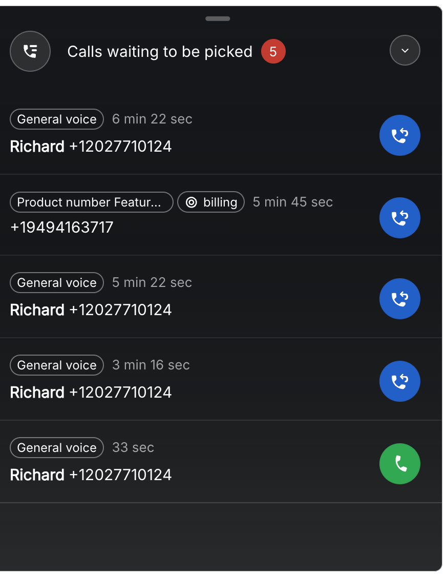
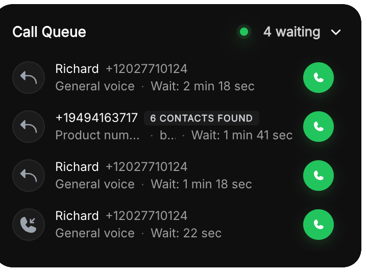
Call queue
Waiting calls are easier to scan, with the queue count moved into the header and wait time set in a lighter type weight.
Before
After
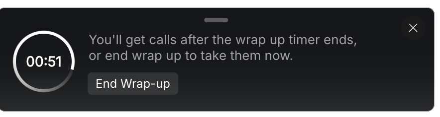
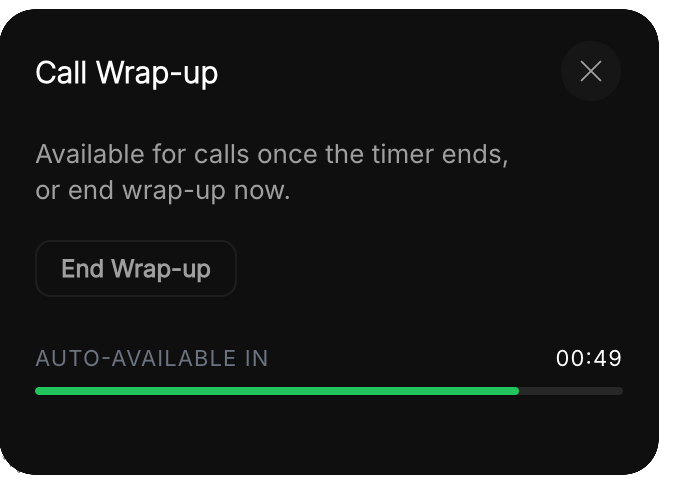
Wrap-up
The square countdown becomes a circular progress ring, paired with a simpler two-line explanation and a single outlined action.
Before
After
Ticket association
The ticket list gains a dedicated search field and switches to bold ticket titles, with the reference ID set as secondary detail.
Before
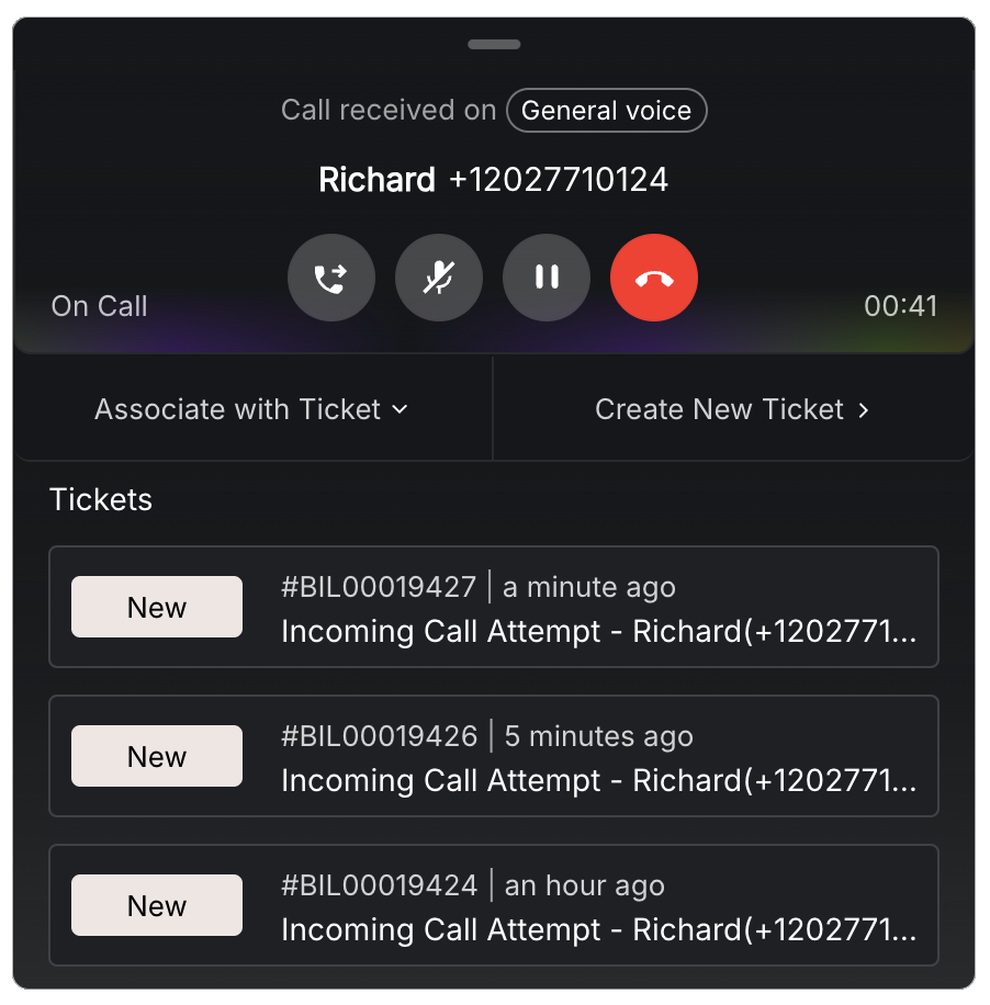
After