2596
2596
Pivot Table:
A pivot table is a table that helps you aggregate your data in a meaningful manner.

Basic Settings
- Clicking on Add Visualization button.
- Give a name for your visualization under the field Name.
- Choose Pivot table from the Visualization type dropdown.
- Select the preferred dataset and date range for which you want to build your visualization.
-
Choose field(s) for Rows. Generally, this could be one of the fields you want to compare. A minimum of one and a maximum of two fields can be added to the Rows. For instance, If you want to summarize the Average response time across Assignees and Categories, Assignee could be brought on rows here.
-
Now choose field(s) for Columns. A minimum of one and a maximum of two fields can be added to the Columns. In the above example, Category should be added to Columns.
-
For Values, add the fields whose value you want to aggregate. Multiple fields can be added under Values. In the above example, the Average response time should be added under Values.
- There are different ways to aggregate the field that you choose for Value. Some options are Count, Sum, Average, Percentile, Distinct Count.
Advanced Settings
- Filter: You can choose to add the required filter conditions.
- Sort: Sort the visualization as required.
- Visualization Settings: You can include row and column wise Total and Average for the Pivot table under the Visualization settings tab by enabling the toggle. You can also choose to include percentages by Row, Column or Total from the Include Percentages drop-down.
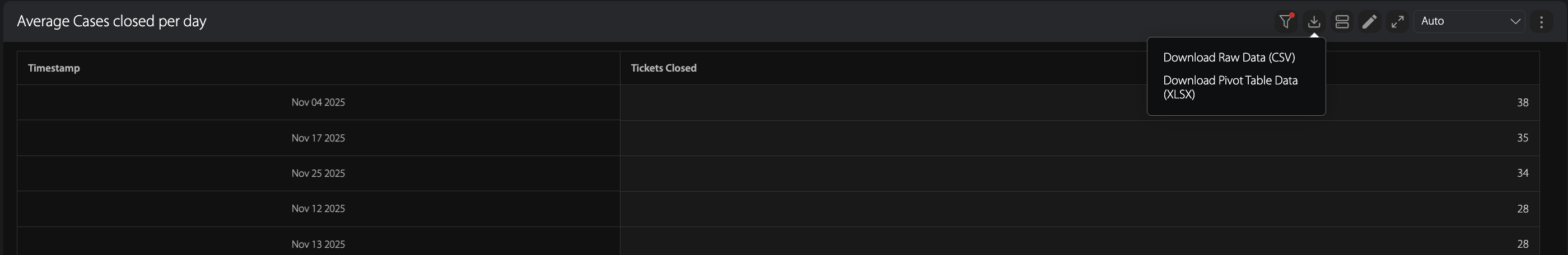
Download Pivot Table Data
Once you have saved your Pivot Table in the report, you have the option to Download the Pivot Table data as an XLSX file by following the steps below:
- Step 1: Click the "Download" icon in the top-right corner of the pivot table in the report.
- Step 2: Click on the "Download Pivot Table Data" from the dropdown that appears upon clicking the Download button. This initiate the download process.